District News
Introducing the Sanitation Foundation
Aug 18, 2020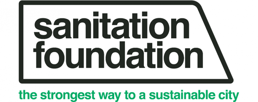
To better align with their organization’s mission and position themselves as innovators in waste reduction, The Foundation for New York’s Strongest has launched a new brand identity: the Sanitation Foundation! Since our organization partners so very closely with DSNY, we thought this story would be of interest.
Emily Oberman, of the world-renowned design firm Pentagram, designed the new visual identity for the Foundation. Oberman assembled an expert team and together they set off to gain a deeper understanding of how to best tell their story. They found that ‘Sanitation Foundation’ connected more with their audience, and was more reflective of their connection to the DSNY and their dedication to advancing the Department’s goals. They have created a new logo, with the shape being a simplified outline of the side of a garbage collection truck — pointing forward like their mission. The white color and Helvetica font are nods to key moments in NYC Sanitation’s rich history, from Colonel Waring’s ‘White Wings' in 1895, to the department’s own rebrand in 1966. They also created a new tagline: “The Strongest Way to a Sustainable City” to show appreciation for the hard work that the men and women of NYC Sanitation do to keep the city clean and sustainable.
Check out the Sanitation Foundation's website to see more of their new brand in action!